ADZ Tech Solutions

Author name: zain

Personalized Invitations, Organized Events: A CRM Built for Lawns

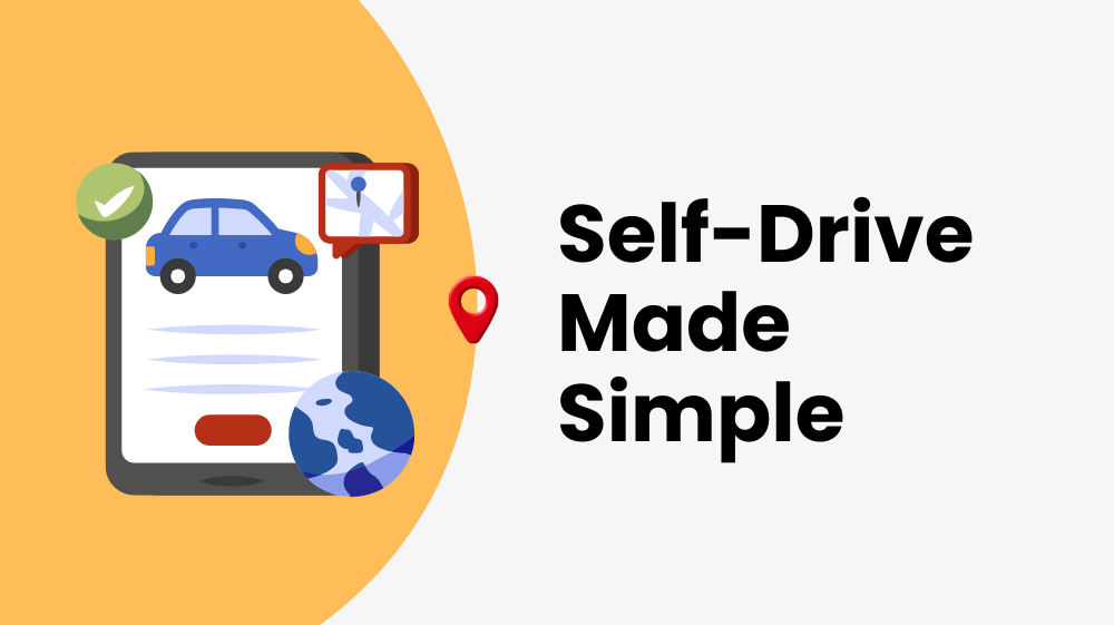
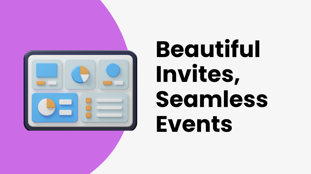
🎉 Case Study Siddhivinyak Lawn Personalized Invitations, Organized Events: A CRM Built for Lawns View Live Project Let’s Connect Introduction Siddhivinayak Lawn wanted a smarter way to manage weddings and events. They needed a system that could handle invitations, themes, feedback, galleries, and even hiring — all from one place. ADZ Tech Solution built a custom Event Management CRM Web App that turned complex planning into a simple, organized, and beautiful experience. 🚧 Challenges What Siddhivinayak Lawn Was Struggling With The team faced several roadblocks in managing events: Complex Invitations Invitations were difficult to design, share, and manage efficiently. Limited Themes Lack of diverse themes for different cultures and religions. No Feedback System No direct way to collect and respond to guest feedback. Manual Gallery Updates Gallery updates (photos/videos) were slow and manual. Unorganized Hiring Job posting and applications were unorganized. No Centralized Control Admins had no single system to control everything easily. 💡 Solutions How We Solved Their Problems Smart solutions that transformed their event management process Smart Invitations Easy-to-use tool for creating and sharing invites. Cultural Themes Added 30 religious and cultural designs. Guest Feedback Built a system for comments and admin replies. Dynamic Gallery Upload, edit, and delete photos/videos anytime. Job Management Job posting and application form inside the system. One Dashboard Central admin panel to control all features. 🚀 Results The Impact We Created Measurable improvements that transformed their business Quick Design Faster Invitations Quick design and easy sharing with guests.   30 Themes Personal Touch 30 themes delighted diverse audiences. Improved Trust Better Engagement Feedback improved trust with clients. Beautiful Display Easy Showcase Events displayed beautifully in the gallery. Professional Organized Hiring Applications became structured and professional. One Dashboard Time Saved Admins managed everything in one dashboard. 📸 Screenshots See the CRM in Action Experience the intuitive interface that transformed event management Home Feedbacks Invitation Dashboard Manage Invitations Create Invitation Dynamic Gallery Job Managment ⚙️ Tech Stack Built with Modern Technology We chose the right tools for scalability, performance, and maintainability 💬 Testimonial What Our Client Say I am really happy with your service, it is exceptional, and Web Design is just great. When I have a question they answer it at once, they have more than outstanding customer service. I would say that Adz Tech Solutions are very professional and their knowledge is incredible, they also solve problems very quickly, and I am impressed. I recommend this company to all my customers, friends, and clients. Ramsingh Bahure Founder The Bahure Group – India 🚘 Ready to Transform Your Business? Want to simplify your event management? Contact ADZ Tech Solution today and let’s build a smart CRM for your lawn, hall, or event business. Let’s Connect

Personalized Invitations, Organized Events: A CRM Built for Lawns Read More »

Click, Confirm, Drive: The Web App That Changed Self-Drive Rentals

🚗 Case Study Gaadileloo Click, Confirm, Drive: The Web App That Changed Self-Drive Rentals View Live Project Let’s Connect Introduction Gaadileloo is a self-drive car rental company that wanted to make booking a car as easy as booking a movie ticket. Their old process was slow, confusing, and full of manual steps. We partnered with them to build a custom web app that made renting cars quick, reliable, and hassle-free. 🚧 Challenges What Customers Faced Before The old system had major roadblocks that frustrated customers and hurt business growth Long booking process Too many steps caused customer frustration and abandonment No real-time availability Customers couldn’t see live car availability online Manual confirmations Slow manual processes delayed customer experience Limited payment options Caused booking drop-offs at checkout Peak hour difficulties System couldn’t handle high traffic periods Clunky interface Poor UX made users abandon their bookings 💡 Solutions How We Solved It We implemented smart solutions that transformed the entire booking experience 3-Step Booking Designed a simple flow → Click → Confirm → Drive Live Availability Integrated real-time car updates for instant visibility Instant Confirmation Automated booking messages for immediate feedback Flexible Payments Added cards, UPI, and wallet options for convenience Scalable System Built to handle peak-hour traffic effortlessly Smooth UI Mobile-first, user-friendly design that converts 🚀 Results The Impact We Delivered Measurable improvements that transformed the business and customer experience 40% Faster Bookings Time reduced significantly 30% Less Drop-Offs Checkout abandonments cut 25% Happier Customers Satisfaction scores rose 2x Higher Growth Bookings doubled in 3 months 100% Trusted Platform Clear confirmations built trust 5hrs Better Efficiency Staff saved hours with automation 📸 Screenshots See It In Action Take a look at the beautiful, intuitive interface that makes car booking effortless Book Ride Booking Form Admin – Dashboard Admin – All Cars Admin – Add New Car Admin – All Orders Admin – Order Details ⚙️ Tech Stack Built with Modern Technology We chose the right tools for scalability, performance, and maintainability 💬 Testimonial What Our Client Say Hats off to Adz Tech Solutions! They did an awesome job for Gaadileloo. Now, booking our self-driving cars and cabs is super smooth with the web app they created. No more worries about manual booking or tricky payments. They sorted out all our issues, like not getting booking confirmations. And hey, they even designed a cool logo for us. Thanks a ton, Adz Tech Solutions! You guys made things so much better for us! Rushikesh Ekale Founder – Gaadileloo 🚘 Ready to Transform Your Business? Want to simplify your self-drive car rental business? Contact ADZ Tech Solutions today and let’s build a web app your customers will love. Let’s Connect

Click, Confirm, Drive: The Web App That Changed Self-Drive Rentals Read More »

Which Logo Sizes and Formats Does Your Brand Need?

Which Logo Sizes and Formats Does Your Brand Need? A logo is the visual representation of your business identity in the world of branding. It is imperative that your logo be adaptable, scalable, and easily identifiable in a range of formats and dimensions.  For best visibility and impact, multiple logo sizes and formats are needed for different platforms and apps. We’ll look at the several kinds of logos your brand needs in this post, along with the sizes and formats that each one requires. 1. Primary Logo: Your primary logo is the main visual representation of your brand identity. It typically includes your brand name and any associated symbols or icons. Sizes and Formats: High-resolution version for print materials: Vector format (e.g., SVG, EPS) for scalability without loss of quality. Size varies based on the application but typically around 300-600 pixels wide. Web version: PNG format with a transparent background for web use. Sizes can vary but usually around 100-300 pixels wide for standard website display. Social media profile picture: Square format (e.g., PNG or JPEG) optimized for each platform’s recommended size (e.g., 180×180 pixels for Facebook, 400×400 pixels for Twitter). 2. Secondary Logo: Essentially, secondary logos are specialized versions of your main brand created for particular purposes or use cases. They could consist of more straightforward variants, new color schemes, or other layouts. Sizes and Formats: Like the main logo, but with modifications possible for particular use scenarios (e.g., simplified version for tiny sizes, stacked layout for vertical spaces). To guarantee brand identification in various circumstances, keep format and resolution consistent. 3. The Favicon: A favicon is a little icon that appears in the browser tab next to the name or URL of your website. When several tabs are open, it makes your website easier for users to find. Sizes and Formats: Typically, square formats (like PNG or ICO) have dimensions between 16×16 and 32×32 pixels. Since the design will be viewed at a small size, keep it clear and uncomplicated. 4. App Icon: In the event that your company offers a mobile application, you will require an app icon to symbolize your brand on users’ gadgets. Sizes and Formats: The size of app icons varies based on the platform and resolution of the device. 512 x 512 pixels for Google Play (Android) and 1024 x 1024 pixels for the App Store (iOS) are typical sizes. To guarantee compatibility and brand guidelines compliance, adhere to platform-specific guidelines on file format and design criteria. 5. Watermark: Watermarks are semi-transparent logos that are superimposed on documents or images to signify branding or ownership. Sizes and Formats: Watermarks are semi-transparent logos that are superimposed on documents or images to signify branding or ownership. Conclusion By understanding the different types of logos your brand needs and the corresponding sizes and formats required for each, you can ensure consistency, visibility, and recognition across various platforms and applications. Reach out & stand out Services Website Development Software Development Graphic Designing Social Media Marketing Search Engine Optimization Content Marketing Android App Development Performance Marketing

Which Logo Sizes and Formats Does Your Brand Need? Read More »

5 Tools for Testing Website Responsiveness on Various Devices and Screen Sizes

5 Tools for Testing Website Responsiveness on Various Devices and Screen Sizes It is crucial in today’s digital world to make sure your website works and looks great on a variety of screens and devices. Users now browse websites on a variety of devices due to the widespread usage of smartphones, tablets, laptops, and desktop computers.  For this reason, it’s critical to test your website’s responsiveness across a range of platforms in order to maintain trust and offer a satisfying customer experience. This post will discuss five excellent resources for evaluating the responsiveness of websites. 1. Responsinator Responsinator is a straightforward and user-friendly tool for evaluating the responsiveness of websites. Entering your URL enables you to view a preview of your website on various platforms, such as PCs, tablets, and smartphones. Key Features: Preview website on multiple devices simultaneously. Customize orientation (portrait or landscape). View website in different resolutions. 2. BrowserStack With a responsive testing function, BrowserStack is a feature-rich cross-browser testing tool. It lets you test how well your website works on different operating systems, devices, and browsers. Important characteristics: Test on actual hardware, such as desktop computers, tablets, and cellphones. Select from a variety of browser and device pairings. Troubleshoot integration problems with developer tools 3. Google Chrome DevTools The Google Chrome browser comes with built-in web development and debugging tools called Google Chrome DevTools. It has a device mode function that allows you to check the responsiveness of websites. Important characteristics: Play with various gadgets and screen dimensions. For testing on mobile devices, simulate touch events. Examine and troubleshoot website components instantly. 4. Lambda Test One of the services offered by LambdaTest, a cloud-based testing platform, is a responsive testing tool. It lets you test your website across a variety of devices, operating systems, and browsers. Important characteristics: Test with actual hardware and cloud-hosted browsers. Screenshot testing for responsive design automatically. Work together as a team and communicate test results. 5. Screenfly by QuirkTools QuirkTools provides a free responsive testing tool called Screenfly. It helps you see how your website looks on different screens, such as PCs, tablets, TVs, and smartphones. Important characteristics: Select a device from a list of pre-configured options or enter custom measurements. Test in both landscape and portrait mode. Share the URL-based responsive test results with others. Conclusion In conclusion, providing the best possible user experience on your website requires making sure it is responsive and suitable with a variety of devices. You can quickly detect and fix any problems with your website’s responsiveness by using the appropriate tools, which will boost user happiness and engagement. Reach out & stand out Services Website Development Software Development Graphic Designing Social Media Marketing Search Engine Optimization Content Marketing Android App Development Performance Marketing

5 Tools for Testing Website Responsiveness on Various Devices and Screen Sizes Read More »

Scroll to Top