ADZ Tech Solutions

Blog

Your blog category

Which Logo Sizes and Formats Does Your Brand Need?

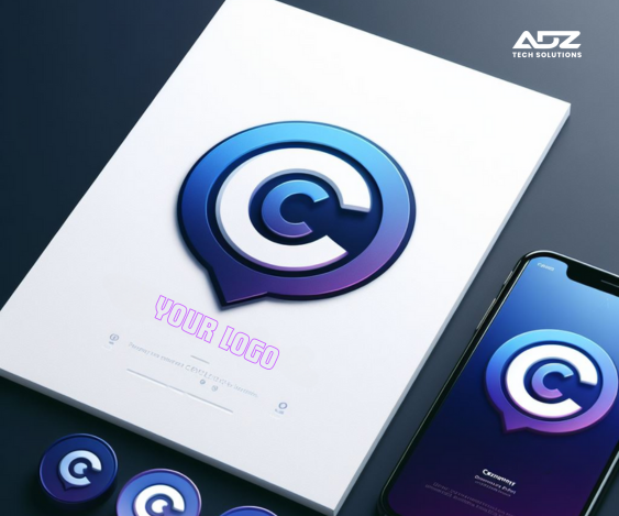
Which Logo Sizes and Formats Does Your Brand Need? A logo is the visual representation of your business identity in the world of branding. It is imperative that your logo be adaptable, scalable, and easily identifiable in a range of formats and dimensions.  For best visibility and impact, multiple logo sizes and formats are needed for different platforms and apps. We’ll look at the several kinds of logos your brand needs in this post, along with the sizes and formats that each one requires. 1. Primary Logo: Your primary logo is the main visual representation of your brand identity. It typically includes your brand name and any associated symbols or icons. Sizes and Formats: High-resolution version for print materials: Vector format (e.g., SVG, EPS) for scalability without loss of quality. Size varies based on the application but typically around 300-600 pixels wide. Web version: PNG format with a transparent background for web use. Sizes can vary but usually around 100-300 pixels wide for standard website display. Social media profile picture: Square format (e.g., PNG or JPEG) optimized for each platform’s recommended size (e.g., 180×180 pixels for Facebook, 400×400 pixels for Twitter). 2. Secondary Logo: Essentially, secondary logos are specialized versions of your main brand created for particular purposes or use cases. They could consist of more straightforward variants, new color schemes, or other layouts. Sizes and Formats: Like the main logo, but with modifications possible for particular use scenarios (e.g., simplified version for tiny sizes, stacked layout for vertical spaces). To guarantee brand identification in various circumstances, keep format and resolution consistent. 3. The Favicon: A favicon is a little icon that appears in the browser tab next to the name or URL of your website. When several tabs are open, it makes your website easier for users to find. Sizes and Formats: Typically, square formats (like PNG or ICO) have dimensions between 16×16 and 32×32 pixels. Since the design will be viewed at a small size, keep it clear and uncomplicated. 4. App Icon: In the event that your company offers a mobile application, you will require an app icon to symbolize your brand on users’ gadgets. Sizes and Formats: The size of app icons varies based on the platform and resolution of the device. 512 x 512 pixels for Google Play (Android) and 1024 x 1024 pixels for the App Store (iOS) are typical sizes. To guarantee compatibility and brand guidelines compliance, adhere to platform-specific guidelines on file format and design criteria. 5. Watermark: Watermarks are semi-transparent logos that are superimposed on documents or images to signify branding or ownership. Sizes and Formats: Watermarks are semi-transparent logos that are superimposed on documents or images to signify branding or ownership. Conclusion By understanding the different types of logos your brand needs and the corresponding sizes and formats required for each, you can ensure consistency, visibility, and recognition across various platforms and applications. Reach out & stand out Services Website Development Software Development Graphic Designing Social Media Marketing Search Engine Optimization Content Marketing Android App Development Performance Marketing

Which Logo Sizes and Formats Does Your Brand Need? Read More »

5 Tools for Testing Website Responsiveness on Various Devices and Screen Sizes

5 Tools for Testing Website Responsiveness on Various Devices and Screen Sizes It is crucial in today’s digital world to make sure your website works and looks great on a variety of screens and devices. Users now browse websites on a variety of devices due to the widespread usage of smartphones, tablets, laptops, and desktop computers.  For this reason, it’s critical to test your website’s responsiveness across a range of platforms in order to maintain trust and offer a satisfying customer experience. This post will discuss five excellent resources for evaluating the responsiveness of websites. 1. Responsinator Responsinator is a straightforward and user-friendly tool for evaluating the responsiveness of websites. Entering your URL enables you to view a preview of your website on various platforms, such as PCs, tablets, and smartphones. Key Features: Preview website on multiple devices simultaneously. Customize orientation (portrait or landscape). View website in different resolutions. 2. BrowserStack With a responsive testing function, BrowserStack is a feature-rich cross-browser testing tool. It lets you test how well your website works on different operating systems, devices, and browsers. Important characteristics: Test on actual hardware, such as desktop computers, tablets, and cellphones. Select from a variety of browser and device pairings. Troubleshoot integration problems with developer tools 3. Google Chrome DevTools The Google Chrome browser comes with built-in web development and debugging tools called Google Chrome DevTools. It has a device mode function that allows you to check the responsiveness of websites. Important characteristics: Play with various gadgets and screen dimensions. For testing on mobile devices, simulate touch events. Examine and troubleshoot website components instantly. 4. Lambda Test One of the services offered by LambdaTest, a cloud-based testing platform, is a responsive testing tool. It lets you test your website across a variety of devices, operating systems, and browsers. Important characteristics: Test with actual hardware and cloud-hosted browsers. Screenshot testing for responsive design automatically. Work together as a team and communicate test results. 5. Screenfly by QuirkTools QuirkTools provides a free responsive testing tool called Screenfly. It helps you see how your website looks on different screens, such as PCs, tablets, TVs, and smartphones. Important characteristics: Select a device from a list of pre-configured options or enter custom measurements. Test in both landscape and portrait mode. Share the URL-based responsive test results with others. Conclusion In conclusion, providing the best possible user experience on your website requires making sure it is responsive and suitable with a variety of devices. You can quickly detect and fix any problems with your website’s responsiveness by using the appropriate tools, which will boost user happiness and engagement. Reach out & stand out Services Website Development Software Development Graphic Designing Social Media Marketing Search Engine Optimization Content Marketing Android App Development Performance Marketing

5 Tools for Testing Website Responsiveness on Various Devices and Screen Sizes Read More »

Scroll to Top